

Taqueria Franco stands as a creative venture, boldly blending the elegance of French cuisine with the approachability of tacos. We sat down with Kanto Magazine to talk about how the process formed this space. Form Follows Flavor: Taqueria Franco by Polygon
The idea is that the space is supposed to be enigmatic from the outside. The simple, black and white, French bulldog logo with the brand’s name is meant to evoke curiosity and encourage people to discover the sensory delights that await inside.
The design concept was born from a desire to elevate common ingredients through technique. Drawing inspiration from this philosophy, the Polygon design team navigated the challenge of infusing a casual dining experience with the finesse associated with Chef Miko’s fine dining background.
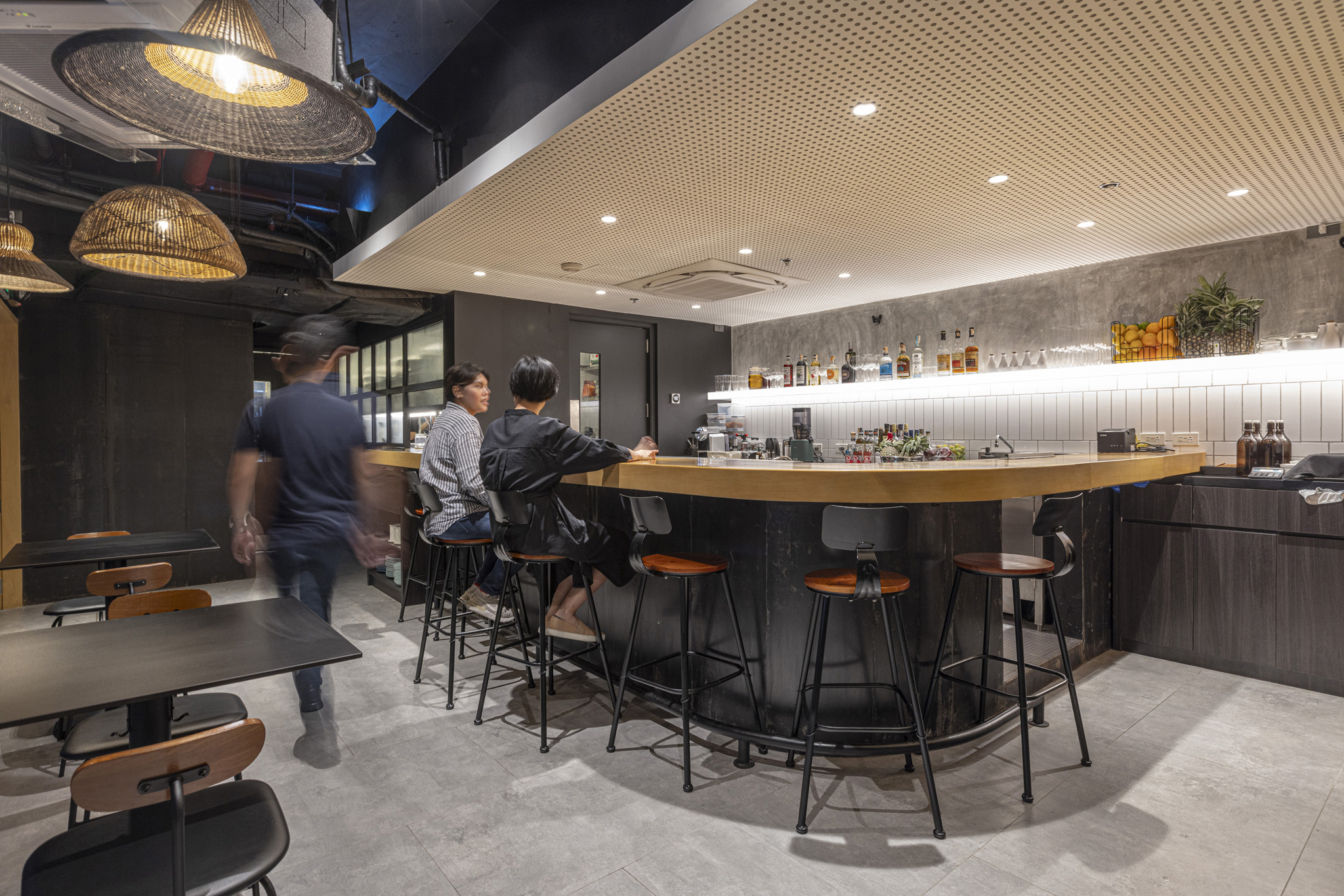
Another thing to note is that while the client wanted the design to introduce a casual dining experience, Chef Miko is quite known for her fine dining background. To address this, we suggested the use of common materials or those that you see on the street, such as concrete, tiles, and steel. It’s how these materials were put together that makes the space elevated. We could say that this design strategy is comparable to how they decided on their menu, as they serve common food such as tacos but add flair to it by applying French techniques that they’ve learned from training.
And more importantly, we talk about what matters for us in designing spaces:
This project reminded us why we aren’t big on bells and whistles. We believe that a space should be beautiful but not enough to overshadow what it represents. Architecture exists to be the backbone… in the story of Taqueria Franco, it plays the role of a stage—not only for the culinary attractions inside but for the passion of the people behind it.
Read more here: Form Follows Flavor: Taqueria Franco by Polygon